背景
你可能会想问:ant-design-vue 还不够强大吗?为什么还要封装?
是的,ant-design-vue 的强大不容置疑,某小厂几乎所有的中后台系统都使用到了 ant-design-vue,其组件已覆盖了项目中的各个角落。
也正因为如此,我在高频率的使用中,发现了一些使用不太利索的地方,比如:
- Table 组件数据交互麻烦、不支持列拖动、拖拽排序、不支持全局修改默认的 pageSize 条数
- Upload 组件不支持 v-model
- Upload 在 FormModel 中也不能使用 rule 校验
- Select 组件每次都要写下拉列表的 for 循环
- 没有年份选择器
等等这一系列小问题,所以我基于它封装了一套组件库,解决了上面提到的问题:
- Table 组件支持 loadData 加载数据,支持列拖动、拖拽排序、支持全局配置 pageSize 参数
- Upload 组件支持 v-model、支持在 FormModel 中使用 rule 校验
- Select 组件支持 loadData 函数,不再写重复的 for 循环
- 新增了年份选择器
- 新增了强大的文件预览组件,支持视频、图片、PDF 等常见文件的预览
因为是基于它封装的,所以 ant-design-vue 所提供的组件都可以正常使用。
目前已有 5+ 的系统在使用 antdv-kit 组件库,如果你也遇到了上面的这些问题,不妨试试吧~
安装
1
2
3
4
5
|
npm i @wytxer/antdv-kit
yarn add @wytxer/antdv-kit
|
组件库依赖于 ant-design-vue 1.x 版本,如果没有安装:
1
2
3
4
5
|
npm i ant-design-vue@^1.7.8
yarn add ant-design-vue@^1.7.8
|
全局引用
1
2
3
4
5
6
7
8
9
10
11
| import AKit from '@wytxer/antdv-kit'
Vue.use(AKit)
Vue.use(AKit, {
pageSize: 20,
textFill: '-'
})
|
使用
1
| <ak-upload v-model="files" />
|
组件使用示例
这里放一部分组件的使用示例,完整的组件库使用文档参见:antdv-kit 组件库使用文档
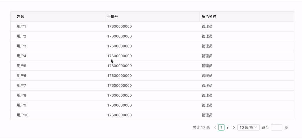
Table 表格
Table 组件支持 loadData 函数加载数据,极大简化了使用,同时封装了可伸缩列、行拖拽排序等功能。例如使用行拖拽排序:
1
2
3
4
5
6
7
8
9
10
11
12
13
14
15
16
17
18
19
20
21
22
23
24
25
26
27
28
29
30
31
32
33
34
35
36
37
38
39
40
41
42
43
44
45
46
47
48
49
| <template>
<ak-table :columns="columns" :loadData="queryTables" dragSort @drop="onDrop" />
</template>
<script>
const queryTables = () => {
const rows = []
for (let i = 1; i < 18; i += 1) {
rows.push({
key: i,
id: i,
name: '用户' + i,
mobile: '17600000000',
roleName: '管理员'
})
}
return { rows }
}
export default {
data () {
return {
queryFilters: {},
columns: [{
title: '姓名',
dataIndex: 'name',
width: 200
}, {
title: '手机号',
dataIndex: 'mobile',
width: 200
}, {
title: '角色名称',
dataIndex: 'roleName',
width: 200
}]
}
},
methods: {
queryTables,
onDrop (sourceItem, targetItem, isDrop) {
console.log(sourceItem, targetItem, isDrop)
}
}
}
</script>
|
效果预览:
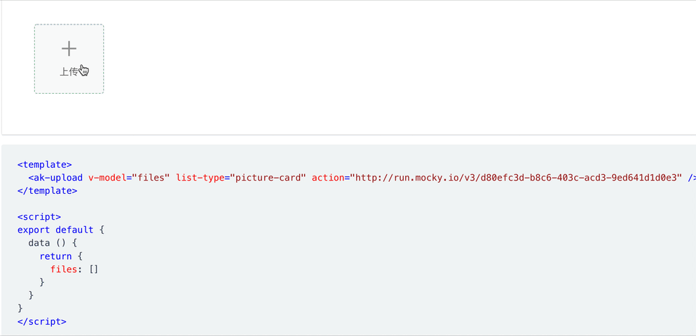
Upload 上传
Upload 组件支持 v-model,支持多种场景的文件上传、内置文件预览、支持文件夹上传、支持并发上传等场景。基础使用如下:
1
2
3
4
5
6
7
8
9
10
11
12
13
| <template>
<ak-upload v-model="files" list-type="picture-card" action="http://run.mocky.io/v3/d80efc3d-b8c6-403c-acd3-9ed641d1d0e3" />
</template>
<script>
export default {
data () {
return {
files: []
}
}
}
</script>
|
效果预览:
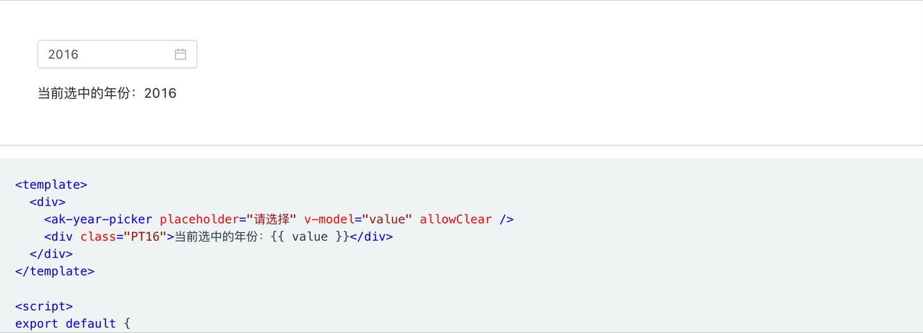
YearPicker 年份选择器
基于 a-date-picker 封装的年份选择器组件,可在需要选择年份的时候使用。基础使用如下:
1
2
3
4
5
6
7
8
9
10
11
12
13
14
15
16
17
18
19
20
21
22
23
| <template>
<ak-upload v-model="files" list-type="picture-card" action="http://run.mocky.io/v3/d80efc3d-b8c6-403c-acd3-9ed641d1d0e3" />
</template>
<script>
<template>
<div>
<ak-year-picker placeholder="请选择" v-model="value" allowClear />
<div class="PT16">当前选中的年份:{{ value }}</div>
</div>
</template>
<script>
export default {
data () {
return {
value: '2019'
}
}
}
</script>
|
效果预览:
代码和文档
感谢阅读,组件库以后会长期维护,欢迎下载使用:antdv-kit 组件库 GitHub 地址
antdv-kit 组件库使用文档也会保持同步更新。
组件库已集成到中后台前端脚手架,更多关于中后台前端脚手架介绍请查看这里:分享一个基于 Vue.js 和 ant-design-vue 的中后台前端脚手架
公众号
